
This stamp, used today in the central library (ZB, “Zentralbibliothek”) branch of the City Library Stuttgart, still uses the offical logos of the city (like in the 1920s). It seems to have been updated with the times, as those logos have been modernised. Font, name and horse above are the logos used today in Stuttgart. Below the name of the offical city departement (departement of cultural affairs, “Kulturamt) responsible for the library and the name of the library itself (city library, “Stadtbibliothek”) is placed in a strong font. It makes for long name. The last line just uses the short form of the branchs name.
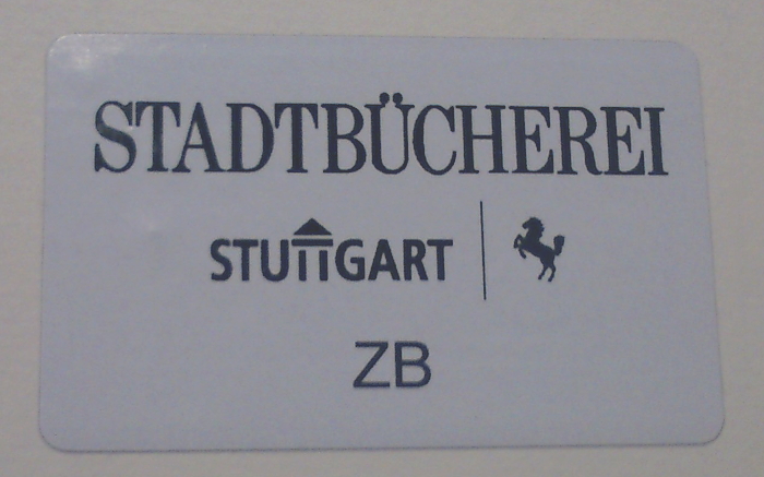
The RFID-Chip, which can be found in every book as well, uses the same official logos and the short form of the branchs name, but for some reason, the old name of the library (whereas “Bücherei” and “Bibliothek” both translate to “Library”, the first word today seems old fashioned, oriented on the idea of “public book parlors”, while “Bibliothek” seems more oriented towards modern libraries with more than books and place to read) in an “older” font. This makes the RFID-chip look more wild than the stamp.


